Sandisk Tries to Distance Itself from its Troubled Past With ‘Bold’ New Logo

After a series of lousy hardware faults, SanDisk’s name turned to mud. More than a year later, the company hopes to make people forget with a fresh new logo.
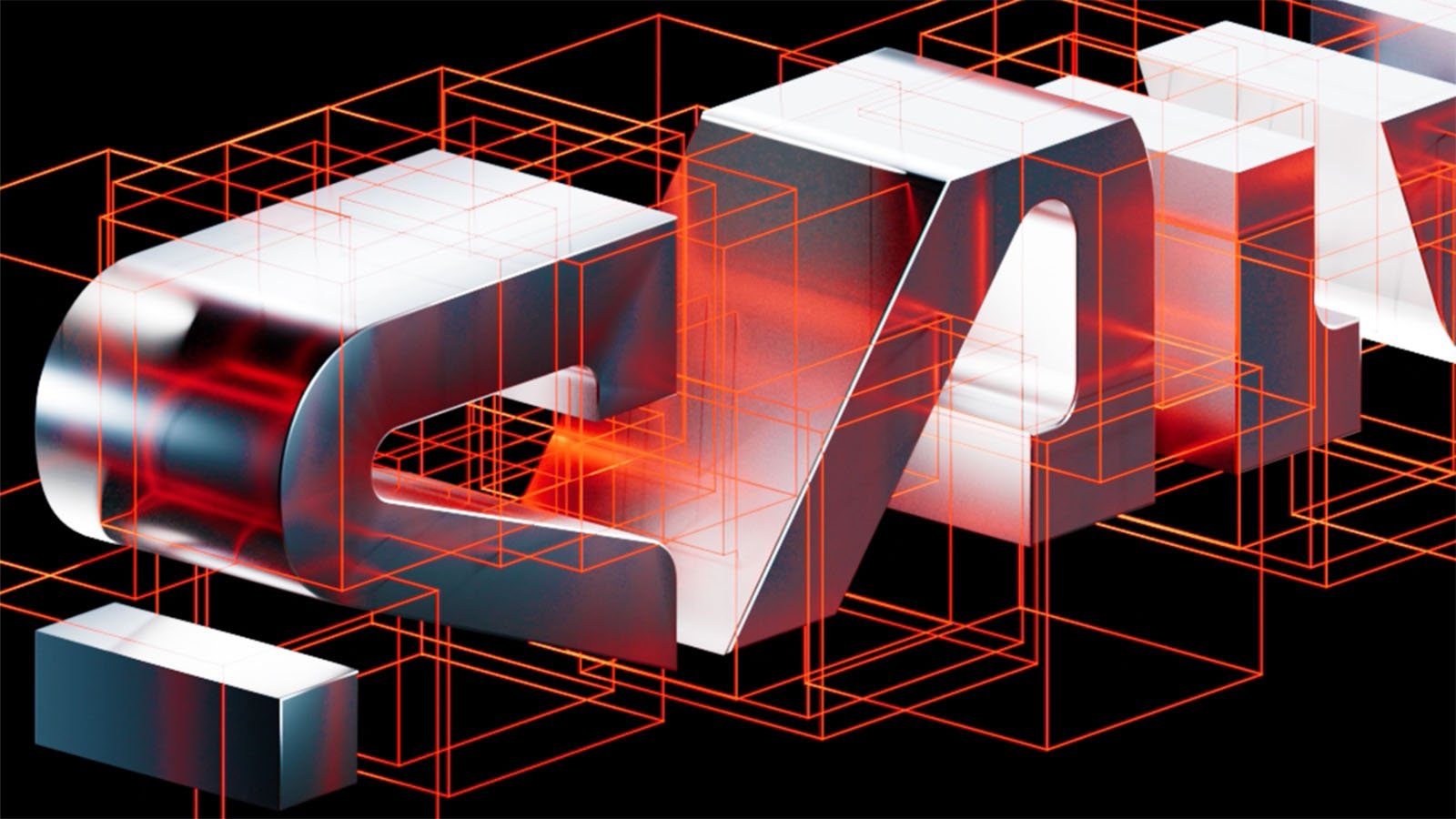
As spotted by Creative Bloq, the new Sandisk logo is making waves, although not entirely for the right reasons. As Joe Foley observes, Sandisk’s — yes, it’s “Sandisk” now, not “SanDisk” — rebrand follows recent design trends by removing bits of typeface from the wordmark. Kia did it, and so too did Nokia.
In Sandisk’s words, though, there’s more to it than simple trend-chasing — the company is trying to rebrand, relaunch, and, reading between the lines, help people forget about recent controversies.
“Sandisk Corporation today previewed its new corporate branding and creative direction, signaling a bold debut of the company’s comeback launch as a standalone Flash and memory technology innovator, planned for early 2025,” Sandisk writes.
I’ll be upfront about it. I do not like the new logo, but I will give Sandisk this, and at least the logo will not be bland. And the reveal video above is excellent, at least for those not at risk of seizures.
Sandisk calls its new logo “distinct,” and aside from the low-hanging fruit of a joke (“dis stinks,” you mean), that’s fair. It is spiritually like other recent and mostly maligned redesigns, but gratefully a far cry from the lifeless mess that is most minimalist rebrands in recent years.
It’s bad, but not in a genuinely dull way. Ultimately, boring is the ultimate sin for a logo, so avoiding that is great and not as common as one might hope for companies that spend huge sums of money on rebrands.

But it commits a nearly-as-bad offense: It is not easy to read, especially when small. The missing chunks, which Foley and others joke are like missing pieces of data (zing), making the logo especially weird when it is viewed at a small size or from a distance.
“Enabling people to experience the potential of their data and move forward in making aspirations real is at the heart of what we do and we were very intentional in creating a mark that embodies the spirit of this thinking,” says Joel Davis, vice president of Creative, Sandisk. “Our visual brand philosophy is inspired by the future and all the diverse ways our customers consume data. Starting with a single pixel, the new Sandisk mark uses bold visual language while being rooted in the idea that progress is not an end point but a way of being.”
That’s all fluffy, and I doubt anyone would ever get the “single pixel” aspect of the design just by looking at the new wordmark. But it gets even more vague and nebulous.
Sandisk continues: the logo’s “clean lines and minimalist design mirror the speed and efficiency of Flash technology. The iconic open D letterform units with a fresh, pixel-driven S, both symbolizing collaboration and partnership, shaping the future of technology. With both vertical and horizontal representations, the mark defies limitation.”

Sandisk worked alongside the Los Angeles-based creative agency ELA Advertising to develop the new brand.
“If the future had a logo, it might look like the new Sandisk mark. We were inspired by the role of technology in driving people forward and wanted to create a word mark that reflects Flash and how people use and consume data,” says Andre Filip, CEO of ELA.
That’s all well and good, and every company says similar things when they rebrand or come out with a new logo, but the only thing that matters is whether it looks good. There are certainly fans of the redesign out there. YouTube comments for Sandisk’s rebranding video are overwhelmingly positive.
“For me one of the Best rebrands this year,” one commenter writes.
“We’ve been starved of good rebranding,” another viewer says. “Never thought I’d appreciate and absolutely love the new look.”
“Standing ovation for THIS,” another adds, finishing their virtual applause with a fire emoji.
“I love it! Wow, I don’t know what to say. You don’t have to be knowledgeable in any design field to know that the redesign looks amazing! I’ve only got positive things to say, oh my gosh,” a particularly enthusiastic fan comments.
Sandisk: “We need a new logo.”
Designer: “What were you thinking?”
Sandisk: “You ever try and scan a document and it cuts off a little bit?”
Designer: “Say no more.” https://t.co/jK7w9YfbUS
— mikeymumbelz (@mikeymumbelz) December 18, 2024
The response has been chiefly positive on social media platforms and websites, too. Some have even said that the new logo will impact their purchasing decisions moving forward, leading them to consider Sandisk products solely because of the rebrand. Style is a woefully poor way to pick products that store your most precious memories and data, but I digress.

There are some critiques, too.
“Must have stored the design files on Sandisk products. Missing data.”
While I certainly disagree with those who think Sandisk’s new mark is great, we can all agree that the video unveiling the new logo is well done, as long as someone isn’t sensitive to bright, flashing lights. And no doubt, coming up with a new wordmark makes sense for Sandisk. The company understandably wants to distance itself from its past, and there are few quicker ways to do that than getting a new look.
The new logo should be seen on new products soon as Sandisk continues its planned spin-off from Western Digital, which will be completed in 2025. Sandisk has a fresh new face; it hopes to get that fresh start it desperately needs. However, it will take a while to re-earn the trust of those who have been paying attention. It’ll take a lot more than a “bold” new wordmark.
Image credits: Featured image created using an asset licensed via Depositphotos.


