Samsung’s Apple Watch Ultra clone forgot to copy the most important thing

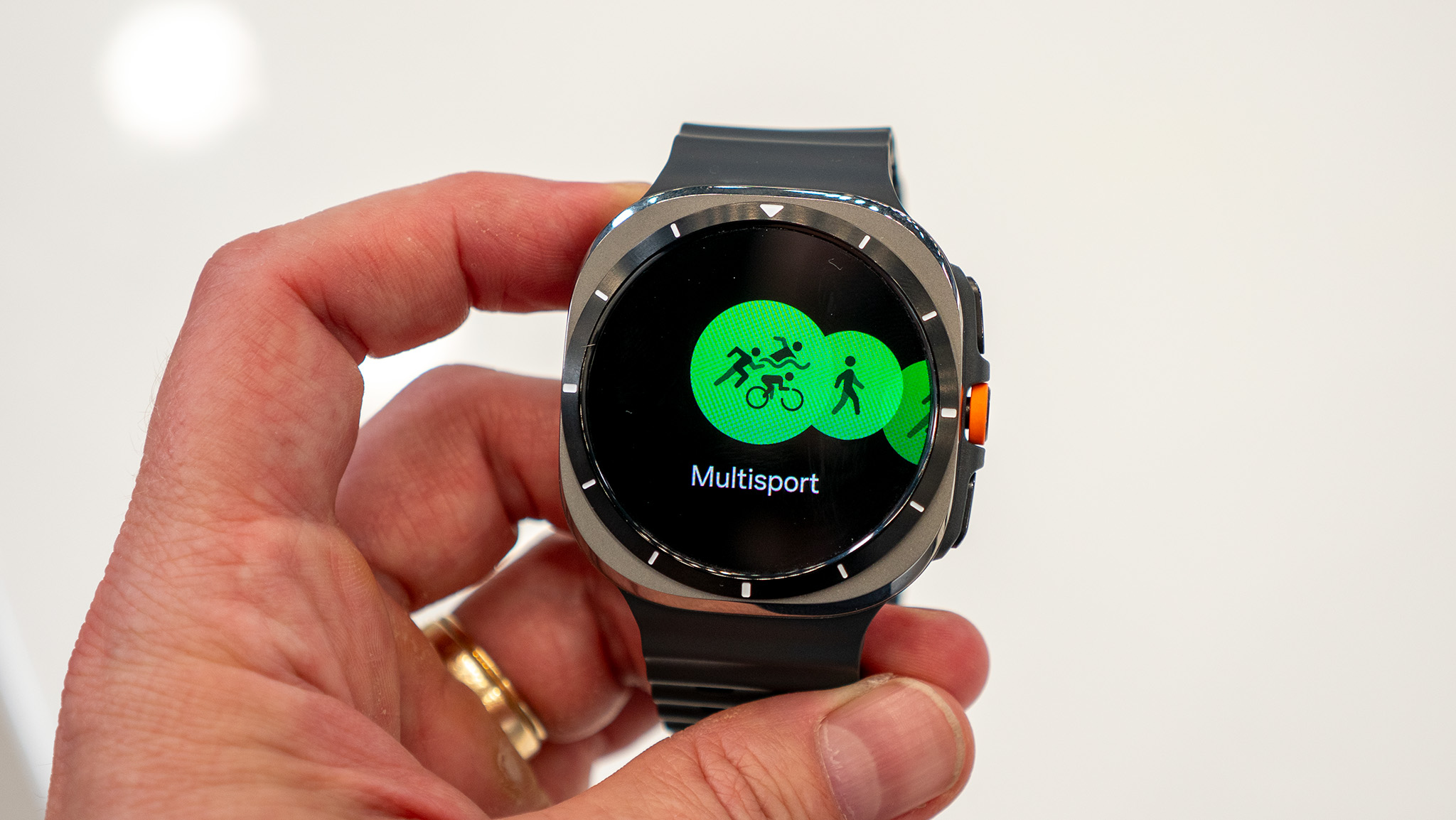
The Galaxy Watch Ultra follows in the Apple Watch Ultra’s footsteps. It looks different with its circular display, but nearly all of its upgrades are inspired by (or copied directly from) Apple’s flagship watch. And I don’t mind this! Instead, I’m frustrated that Samsung didn’t “borrow” the controls from other flagship watches like Apple’s or Garmin’s.
I titled my Apple Watch Ultra 2 review “Your move, Samsung” because I wanted Samsung to release an Ultra watch of its own, emphasizing fitness to cater to athletes who crave stronger GPS battery life and performance within the Wear OS experience.
My Galaxy Watch Ultra review unit arrives this week, but my colleague Nick Sutrich’s Galaxy Watch Ultra hands-on gave me a remote glimpse at what to expect. And all of its key upgrades — the high-grade titanium built to withstand altitude and diving, an emergency siren, extra button shortcuts, a 3,000-nit display, similar sporty bands, and the overall squircle shape — are inspired (if not copied) from Apple.
And as I said, this doesn’t bother me. The Apple Watch Ultra 2 is great! And Samsung addressed my main criticisms of it: the Galaxy Watch Ultra allegedly lasts 60 hours with AOD vs. Apple’s 36 hours without AOD, and costs $150 less.
But why, oh why, did Samsung release a smartwatch for athletes without a physically rotating bezel, a crown, or up/down buttons? There isn’t even a digital bezel; all you can do is swipe!
Samsung has wavered between digital “Active” bezels and physical “Classic” bezels over the last few years, for good reason. I loved my Galaxy Watch 5 Pro for the battery life, but felt that sweaty fingertips and watch displays have always been a match made in hell. Then I loved the Galaxy Watch 6 Classic for the ease of the tactile physical bezel, while disliking how the extra weight made it a burden to wear.
I assumed from leaked Watch Ultra renders that it would have a rotating titanium bezel; turns out it’s just shiny metal. I also had a flash of hope that the side orange button would turn out to be a crown, but no such luck. To be honest, I was seeing what I wanted to see.
Swiping on a touchscreen works perfectly well in normal circumstances, and the lack of an elevated rotating bezel ensures your finger doesn’t feel hemmed in. But while I’m running, hiking, or cycling, the last thing I want is to tap and swipe futilely on a 1.5-inch touchscreen and have my sweat get in the way.
I can understand why Samsung didn’t add a physical bezel. The Watch Ultra weighs 60.5g without the strap, 1g less than the Apple Watch Ultra 2. That extra bezel would balloon the weight on an already hefty case.

But then it wasn’t willing to add a crown. Maybe that would have made the Galaxy Watch Ultra even more of an Apple Watch Ultra clone, and Samsung wanted to keep its design distinct. But originality is a double-edged sword in this category.
Fitness watch brands like COROS, Amazfit, TicWatch, and Google Pixel all use crowns. Garmin and Polar stick to the classic up/down buttons, which are slower to press but very reliable when you’re on the move. I’ve seen plenty of debates from athletes and fitness writers on whether crowns or buttons are better.
I’ve never, ever seen anyone say they prefer using their touchscreen during a workout. Many fitness watches disable their touchscreens during workouts so accidental touches don’t derail your workout tracking.
So for Samsung to design its expensive Galaxy Watch Ultra with free-spending athletes in mind, without giving them reliable controls during workouts, feels like shooting themselves in the foot.
I can’t tell you that it’s a deal-breaker until I test it for myself, and it’ll certainly be a great Android watch for battery life and performance. But since the Galaxy Watch 7 also got dual-band GPS, sporty straps, new racing routes, and a 1.5-inch display option for half the price, I wonder if some Android-loving athletes will stick with the cheaper option and accept missing out on the perks.


