Leica LUX Re-Review: A Year of Progression, But Still a Few Stops Short

When I first reviewed Leica LUX, I approached it with a blend of cautious optimism and healthy skepticism. Leica’s decision to enter the mobile photography app space was bold, considering both the reverence surrounding the Leica name and the saturated, high-standard world of iPhone photography apps — where names like Halide, Obscura, and ProCamera dominate. At launch, Leica LUX showed promise but also left a lot to be desired. Now, nearly a year later, it’s time to revisit it. Spoiler alert: there’s been meaningful progress — but also stubborn blind spots that Leica needs to address if LUX wants to compete at the top tier.
Whether you’re a curious first-time user or a returning enthusiast, this updated review is for you.
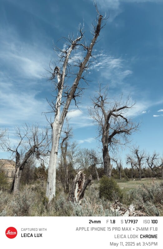
Author’s Note: All images are presented unedited beyond the applied Leica Look, which will be stated in the caption or within the information on the Leica Frame.
What Is Leica LUX?

Leica LUX is Leica’s flagship iPhone camera app, designed to bring the visual and tactile spirit of the company’s classic and modern lenses to mobile photography. Its standout feature — then and now — is the Leica Looks system, which simulates the color rendering and character of specific Leica lenses from different eras. From classic low-contrast 1930s uncoated glass to modern APO-Summicron precision, the app strives to deliver an aesthetic that bridges Leica’s storied analog history and today’s digital convenience.
But Leica LUX is not just a set of Instagram filters. It’s an attempt to imbue your iPhone shots with the look, feel, and metadata of a Leica experience, with customizable framing, smart processing, and, in theory, more photographer-oriented controls. It even lets you include metadata that mimics a Leica M-series file, complete with simulated lens info.
![]()
When I last reviewed it, the bones were there, but the interface was clunky, key features were missing, and the app struggled to find a balance between professional control and user-friendly simplicity. I’m revisiting it after nearly a year of updates and tweaks. And to Leica’s credit, they have changed/fixed a lot and have put out very frequent updates. Here’s what’s changed and what still needs to.
What’s New: Meaningful Additions and Welcome Refinements
New Lens Looks: A Nod to Both the Beginning and the Edge
Three new Leica Looks have joined the catalog, and all are meaningful choices:
![]()
Leica I Model A (1925): Based on the first mass-produced 35mm camera — the Leica I, aka Model A — its addition is a historical treat. Soft, lower contrast, gentle roll-off — precisely what you’d expect from a nearly 100-year-old lens. It’s ideal for nostalgic street photography or portraits with an antique feel. By the way, it does crop to a 50mm-equivalent image to fully mimic the Leica I look.
![]()
Leica I-Summicron 120mm f/2.0 ASPH: This isn’t a real lens, and that’s part of the intrigue. It represents Leica’s push into computational simulation of imagined optics while taking full advantage of the 120mm-equivalent telephoto lenses on the iPhone 15 Pro Max, 16 Pro, and 16 Pro Max. This one is purportedly modeled after the Summilux-M 90mm f/1.5 ASPH.
![]()
Leica I-Thambar 120mm f/2.8: This new addition is designed for portraiture, based on the famous (or infamous to some) 1930s Thambar-M 90mm f/2.2. The Thambar-M 90mm was known for producing extraordinarily soft, glowy, “dreamy” photos wide open (basically, it had a massive amount of spherical aberration). This simulation aims to replicate that.
Both simulations are genuinely enjoyable to use. They offer more than just tint shifts or LUTs — they approximate the tonal curves and depth characteristics (and sometimes a little bokeh swirl) of the lenses they mimic, and in well-lit scenarios, they succeed remarkably well.
Leica Look Intensity and Grain Sliders
![]()
A long-requested feature has finally arrived: the ability to adjust the intensity of each Leica Look from 0–100%. Previously, you either had to live with the baked-in simulation or abandon it. Now, you can dial in the effect to your taste. This brings LUX closer to pro apps like Halide, where control and subtlety reign.
For instance, using the Leica Eternal Look at 40-60% intensity gives a beautiful modern crispness without blowing out contrast or saturation. When I originally reviewed the app, I called Leica Eternal “simply garish in most circumstances and easily the worst of all of them.” With the ability to adjust intensity, it has become one of my favorites.
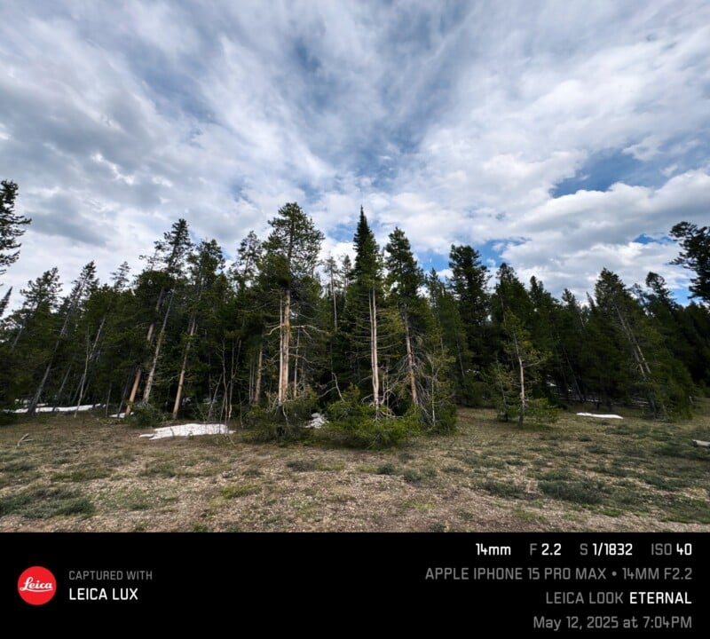
You may also adjust the level of grain, which starts at 0 for all of the Looks.
Two exceptions: For the Artist Greg Williams Look, you can only change the contrast. For the Leica I Model A Look, you cannot change anything. Those Looks are designed for a specific aesthetic, so it’s understandable that Leica wants them to remain as they are. I haven’t had enough time to really use the Greg Williams Look (it was just introduced recently), but the Leica I Model A is quite pleasant.

Option to Choose Favorite Leica Looks
As the Leica Look catalog grows, it becomes increasingly cluttered. Unfortunately, you still cannot hide the Looks you don’t use. However, you can favorite the ones you do use, and just choose the Favorites (or star symbol) when opening the Looks. This is exceptionally nice.

As a personal aside, the Looks in my favorites — the ones I like and use almost exclusively — are Leica Natural, Leica Classic, Leica Contemporary, Leica Eternal, Leica IA, Leica BW High Contrast, Leica BW Natural, and the Artist Greg Williams Look (mostly because it’s new and I’m testing it out).
Smart Processing Options
![]()
Previously, the Smart Processing toggle was binary: on or off. You either bought into Leica’s tone-mapped enhancements or avoided them altogether. Now, a “Minimal” setting strikes a balance. It retains Leica’s tonal intent without overly smoothing skin or nuking shadow detail.
This is a small change on the surface but a huge win for users who want control without full manual processing. It’s especially useful when paired with the new Look intensity slider — giving you real, incremental choice over how “Leica” your image looks.
True DNG RAW
![]()
Leica finally implemented (and I believe rather recently because I don’t recall it as an option on my trip out west last month) a regular “RAW” option alongside the already-existing “ProRAW” option. According to the app, regular “RAW” is what you should choose if you want “to turn off all processing.” I assume this is similar to Halide’s “Process Zero” mode.
However, you also lose the ability to use Leica Looks in regular RAW — and I’m not really sure why. Leica should allow a “RAW + Leica Look” workflow — apply the Look non-destructively in a sidecar file, and let users develop it later with full control (I mean that’s exactly what it does with ProRAW). Regular cameras do this all the time; Fujifilm does it with its film simulations, so why can’t Leica LUX? The problem is that if you 1) can’t use RAW DNG in Aperture mode (which is not a limitation of Leica LUX — all apps are like that), and 2) can’t use the Leica Looks, then… why use the app at all? If you don’t care about regular RAW and prefer ProRAW/HEIC/JPEG, then don’t worry about this!
Leica Frame Feature: Style and Metadata

Leica has added a “Leica Frame” feature that allows you to apply a white, black, clear, or faux-film border around your photo. However, the real treat is the customization of the new metadata. You can choose to include just the date, just the lens, or go full Leica EXIF, which will consist of everything from the Leica Look you chose to the focal length and aperture (whether real or simulated), shutter speed, ISO, and type of phone.
For enthusiasts and social posters alike, this feature attempts to bridge the experience gap between mobile and rangefinder. A shot framed with the 35mm Summicron Look, embedded with lens metadata, and exported with a black border suddenly feels like something you could hang next to a silver gelatin print.
There are four types to choose from, and I’ve included at least one of each throughout this article: a basic white lower border, a black one, a clear one, and finally, a film strip border on both the top and bottom. None of them interferes with any part of your image except for the clear one, which is overlaid across the bottom of the photo. Because of this, I kind of hate it.
Are they gimmicky? Sure. But it’s also fun, and crucially — it’s optional.
Ability to Change Leica Look and “Focal Length” in Post
Previously, whatever Leica Look you chose — that was it. Now, you can change to whatever Look you want after the fact.

Just as significantly, you can now change your Aperture mode lens simulation. Say you shot a photo with the 50mm Noctilux simulation. Well, the app still saved the entire file, and you can change it to the 28mm or 35mm Summilux options if you find yourself wanting it wider.
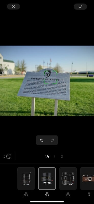
The only problem is that you cannot change the Look or “focal length” (i.e., a crop) in post if you shoot in regular RAW, and you cannot change the “focal length” at all unless you shoot in Aperture mode. I’ll return to this with some of the criticisms I still have below.
Feature Voting Board
Leica has implemented a” Suggest & vote on features” category in the Contact part of the menu. It allows users to suggest any features they want to see, and other users can upvote them.
I absolutely love this, and I think I suggested it internally to Leica when I first reviewed it. I wish every single camera company would do this, both for existing products for firmware updates and for future products.

As you can see, currently the top four suggestions are: Different aspect ratios, Night Mode, Leica Looks for RAW Photos (I’m not sure why they mentioned ProRAW, which can already use Leica Looks), and Black & White Color Filters for the monochrome modes (such as red, green, yellow — like Fujifilm offers on its cameras). Other high-ranking suggestions are Leica Perspective Control, a “Bloom” Filter, allowing digital zoom in Photo Mode, burst mode, and Professional Video Mode.
Last But Not Least: the Leica LUX Grip

Earlier this year, Leica announced the Leica Lux Grip, which looks like — at least on paper — an excellently designed piece of kit (though certainly overpriced). Unfortunately, I have been on a list for a loaner for a while now and have not been able to get one, so I cannot comment on it beyond what has already been published.
Room for Improvement: What Leica LUX Needs to Fix

Despite these improvements, some problems remain unchanged — or have only grown more frustrating with time.
Where Are the 28mm and 35mm Crops?
The inability to select crop modes like 28mm or 35mm in Photo mode (you can choose them in Aperture mode, but then you are limited to 12MP HEIF/JPEG) is baffling, especially given how central those focal lengths are to Leica’s M heritage. You can simulate a 28mm and 35mm lens, but can’t crop to a 35mm field of view?
Halide and Obscura both offer crop overlays and sensor-level cropping — as does the native iPhone camera app. There’s no excuse for LUX to ignore this basic framing tool — especially when it already allows for focal length simulation. This should be near the top of Leica’s roadmap.
Still No 24MP Mode

This remains one of the most significant technical drawbacks. Leica LUX still only offers 12MP or 48MP (unless in Aperture mode, which has a 12MP ceiling), which is a hard sell when Halide, Apple ProRAW, and even the native camera app offer 24MP capture on supported devices.
The iPhone 14 Pro and newer models are capable of high-resolution imagery. By not offering a 24MP mode — or even the option to prioritize resolution over speed — LUX keeps itself stuck in the past. Leica, of all companies, should not be afraid of detail.
More Lens Simulations, Please!

The addition of three new lens Looks is appreciated, but Leica LUX’s future depends on expanding this catalog. Here are lenses that feel conspicuously absent:
- 16-18-21mm f/4 Tri-Elmar-M ASPH
- Make more use of that ultrawide lens! Especially now that the 16 Pro models (and certainly future models) have upgraded 48MP ultrawide cameras.
- 21mm f/1.4 Summilux ASPH
- 24mm f/1.4 Summilux ASPH
- This one is an especially odd omission because the normal lens’s widest “focal length” in Aperture mode is 28mm. But the lens itself is a 24mm-equivalent, and Leica has made numerous 24mm lenses in the past: f/1.4 Summilux-M ASPH, f/2.8 Elmarit-M ASPH, f/3.8 Elmar-M ASPH, and the f/3.5 Super-Elmar-S ASPH.
- 40mm f/2 Summicron-C or 40mm f/2.4 Summarit
- 40-45mm is my single favorite focal length, and either the 40mm Summicron (from the Leica CL) or the 40mm Summarit (from the Leica Minilux) would be good inspirations for a lens simulation.
- 50mm f/2 Summitar
- This is one lens I always loved — it has gorgeous, swirly bokeh that can rival a Helios lens. If Leica could recreate that look, it would be a winner.
- 75mm f/1.25 Noctilux ASPH
- 90mm f/1.5 Summilux ASPH
- These last two would be perfect for phones like the 15 Pro, with their 77mm-equivalent telephoto lens. Also, the rumor is that the 17 Pro and 17 Pro Max will feature 3.5x (instead of 5x) telephoto lenses (about 85mm-equivalent). While the 90 Summilux is the inspiration for the 120mm Summicron, there’s no reason we can’t have both, especially if Apple does move away from the 5x telephoto lens (and for users who have the shorter 3x telephoto lens).
These aren’t just wishlist items. Each of these lenses offers a distinctive rendering — especially the 75 Noctilux and the 50mm Summitar — and their absence limits the creative range of LUX’s simulation capabilities.

If Leica wants LUX to be more than a novelty, it needs to offer the full range of its optical character — and utilize more ultrawide and telephoto focal lengths.
Accessing Exposure Settings Should Be a Swipe Up
This was one of my main gripes in the original review, and unfortunately, it remains a problem. When you swipe down to access ISO and shutter speed, it’s all too easy to accidentally nudge the exposure compensation slider, which sits just above. It’s also counterintuitive to swipe down to any user who’s accustomed to the iPhone camera app. Given that Leica LUX is only for iPhone, I feel this would include literally everyone who uses the app.
![]()
The solution? Just do what Apple does: make these settings accessible via a swipe up. I’ve used this app a lot, and I have never — not once — been able to access the controls on the first try because I always try to swipe up.
Switching Between Photo and Aperture Mode: Still More Hassle Than Need Be
Switching between Photo and Aperture modes still requires a clumsy two-tap process: tap the mode icon, which then brings up the shooting menu, then select the mode. This is slow and unintuitive in the field.
Just make them separate, one-tap buttons, or at the very least, allow one of the custom function buttons to act as a toggle. All you need is a single button that only toggles between P and A mode, and then a separate button that only brings up the shooting menu.
![]()
It’s doubly frustrating because this could be fixed in minutes — I think, I’ve never designed an app in my life — and would dramatically improve usability.
Plus, there’s plenty of room! Just do it!
Editing Options Are Still Slim
Here’s what you can do in the app, in post (and again, some of these have caveats): you can change the Leica Look (except in regular RAW DNG), and you can change the “focal length” or lens selection if the photo was taken in Aperture mode. You can also reposition the focus point, adjust the depth-of-field, and change the intensity and grain of the Leica Looks.

What you cannot do: everything else. Want to crop the photo to a different aspect ratio? Too bad! Want to straighten the photo? Go somewhere else for that nonsense. Want to adjust saturation and brightness a little? Might as well wish for a real Leica to materialize in your hands, because it ain’t happening.
Now luckily, Leica has done a great job integrating Leica LUX with the native iPhone photo library. So, any changes you make in the photo library (leveling, cropping, saturation, brightness, whatever it may be) will instantly port over to the same image in the Leica LUX library. That’s probably why Leica didn’t build all that functionality in its own app, and I understand that. Still, it’s a little annoying to go back and forth.
Still No Night Mode Equivalent
This is a surprising omission. The minimum shutter speed in manual mode is 1 second — but using it causes massive screen lag, and handheld results are unusable. Furthermore, in auto mode, the shutter speed will bottom out at 1/15s and refuse to go any lower.

In practice, LUX is not usable in low light unless you use a tripod or brace the phone on something solid — but even then, you’re limited to a maximum 1 second exposure.
Even a basic multi-frame night option would elevate LUX tremendously, especially when paired with the classic lens simulations.
The Price
This is still a real oomph area with me. It’s the same as it was at launch, and while the app is significantly better than it was at launch, it’s not worth $70 a year or $7 a month. Halide and ProCamera are both more advanced with better UIs, and they cost far, far less.
Leica needs to lower the price to about $3 a month, $20 a year, and $50 or so for a lifetime subscription.
You can use the app without paying for it, but you’ll be locked out of a lot of features.
There is a two-week free trial, so take advantage of that!
Still a Ways to Go, but It’s Come Very, Very Far
![]()
Leica LUX has grown over the past year. There’s no denying it. The addition of new Leica Looks, the intensity slider, the improved Smart Processing, the added lens simulations, and the Leica Frame options are all thoughtful, well-executed, and meaningful upgrades. They show a commitment to refining the user experience without losing sight of the app’s unique mission: to make iPhone photography feel more like shooting with a Leica. And that’s not to mention the plethora of other changes (some small, some big, all important) that Leica has made here and there.
But for all that growth, the app is still limited by decisions that range from odd (no 24MP options?) to frustrating (no Leica Looks with regular RAW, clumsy mode switching) to baffling (no 28 or 35mm crop modes).
In many ways, LUX remains a philosophical app rather than a practical one — more about feeling like you’re shooting with a Leica than truly empowering you with Leica-level control. That may be enough for casual users or Leica loyalists who want their phone shots to echo their M-series work. But for more demanding photographers, the limitations are still real.
![]()
The good news is that Leica seems to be listening. I genuinely mean I haven’t seen this number of improvements from a company like that in such a short time — many of them were almost certainly based on feedback I (and almost definitely others) gave them at launch. Updates have been steady, and the latest ones show a clear responsiveness to user feedback. If Leica keeps going, keeps refining, and drops their price in the realm of sanity, LUX could easily become one of the top camera apps on iOS.
But it’s not there yet.
For now, LUX remains a beautifully designed, occasionally frustrating app that shines when it’s not trying too hard — and still needs a few more steps to fully live up to its red dot heritage.
I will end by saying: I’ve never reviewed a product a second time — of my own free will no less. I suggested this follow-up precisely because I do love using the app, and I’d love using it even more if it became what it could become.
Source link


