Box Art Brawl – Duel: Contra 4

Be sure to cast your votes in the poll below; but first, let’s check out the box art designs themselves.
North America
We love the composition with North America’s variant of Contra 4. The logo looks fantastic at the top, with protagonists Bill Rizer and Lance Bean striking an awesome pose in the centre of the image. It’s pretty dark overall, but we like how it gives the whole piece a bit of a moody atmosphere. Nice stuff.
Japan

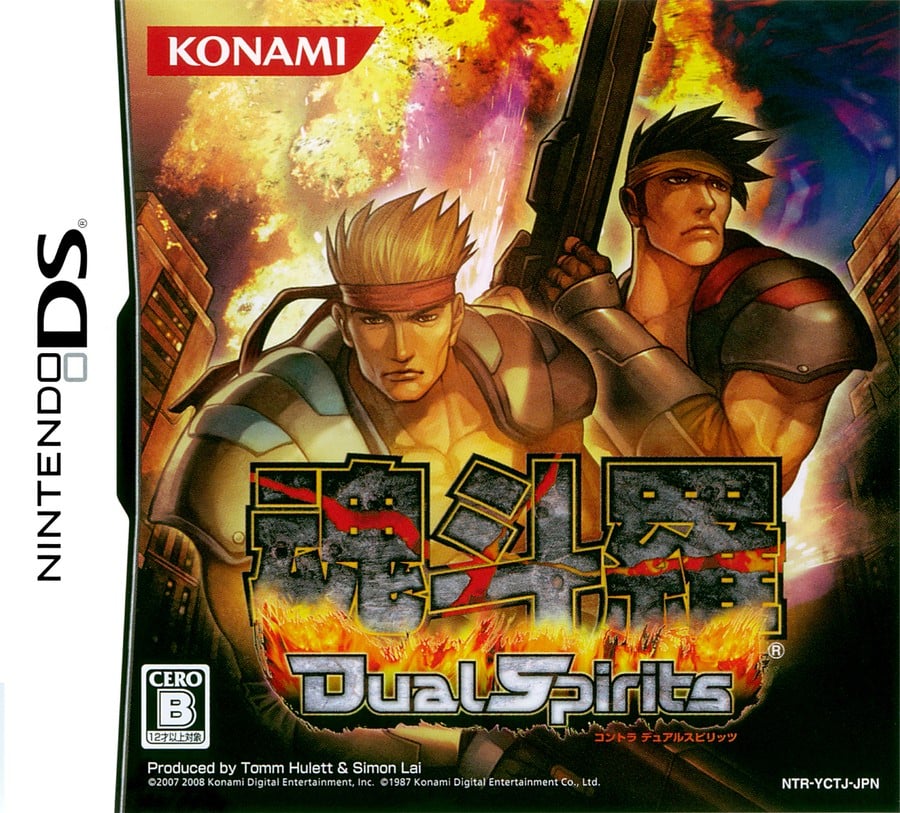
Japan’s variant, in which the game title is Contra: Dual Spirits, takes on a more stylised approach with its character design. It’s not quite venturing into the realm of anime, but it’s certainly close. It’s a bit brighter than its Western counterpart overall, but again, there’s a certain moodiness to the colours utilised here.
Thanks for voting! We’ll see you next time for another round of Box Art Brawl.


