Google is once again experimenting with the UI for its native Contacts app. Following a prior leak where the app’s single-contact page looked to be getting a more decluttered view, a new tweak has been uncovered…only this time it tackles the top search bar.
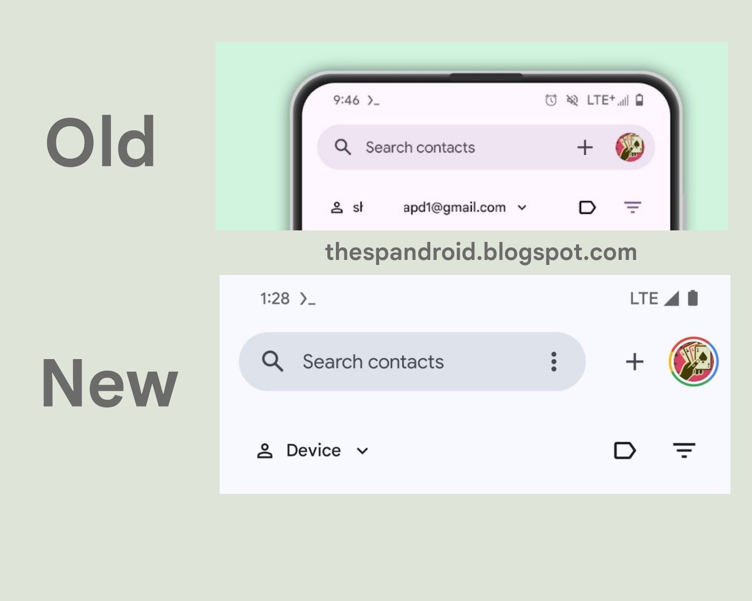
In keeping with the spirit of spring-cleaning and decluttering, Google has a minor redesign in the works for the top search bar of the Contacts app, where the account switcher and the “add contact” button are getting bumped off to the side. It’s a small change, but the whole change feels very Play Store-esque.
Image Credit: TheSPAndroid
This isn’t a change that is available to the public yet, as it is neatly tucked behind hidden flags, the kind you need a rooted Android to enable. The scoop comes courtesy of AssembleDebug over on TheSpAndroid, who has found several of these UI tweaks over the past few weeks.
It’s a work in progress that could be dead in the water by next week, as Google seems to experiment with various designs at once and could at any moment nix one in favor of the other. However, the question remains whether this is just part of a larger redesign or perhaps a complete overhaul of the Contacts app. Contacts is not exactly an app that one frequently opens as a standalone app, but is mostly just where your contacts live that you access through other apps.
Given this, one tends to wonder if Google spending time on this redesign signals a bigger change. Perhaps there’s a new feature in the works that warrants elements of the UI being switched around? It wouldn’t be completely off-brand when you consider that Google I/O is just around the corner, and this is when Google typically announces upcoming features for the forthcoming version of Android. It’s fun to speculate, and we only have a few more weeks before we hopefully find out what Google has in store for the Contacts app.